
Alli360 is an enterprise platform that has evolved over nearly a decade by stitching together multiple tools and workflows. As a result, the platform suffered from inconsistent UI patterns, fragmented experiences, and inefficient design–engineering collaboration.
I led the design effort to establish Alli360’s first scalable design system, aligning design and development around a shared foundation while incrementally modernizing the platform experience.
This project was both a UX initiative and an organizational one — focused on improving user experience and increasing development efficiency at scale.

A fragmented experience at scale
The platform was built by combining different tools over time. UI patterns varied significantly across surfaces and teams.Designers referenced a UI kit, while developers customized Ant Design components independently.
This resulted in:
Inconsistent experiences for users
Repeated design–engineering misalignment
Slower development and longer QA cycles
The design team saw an opportunity not just to standardize visuals, but to reset how design and engineering collaborated.

01 - Balancing mismatched priorities across teams
With limited resources, this project ran alongside other high-priority initiatives. Maintaining momentum required constant reprioritization and communication.

02 - Designing the system while implementing it
System guidelines were being defined at the same time components were being built and shipped — increasing the risk of inconsistencies and rework.
03 - Building trust in a large, long-term initiative
The scale of the project raised concerns among stakeholders. Each change needed to demonstrate clear value to maintain confidence and buy-in.
01 - Establishing shared ownership and clarity
Documentation + workflow
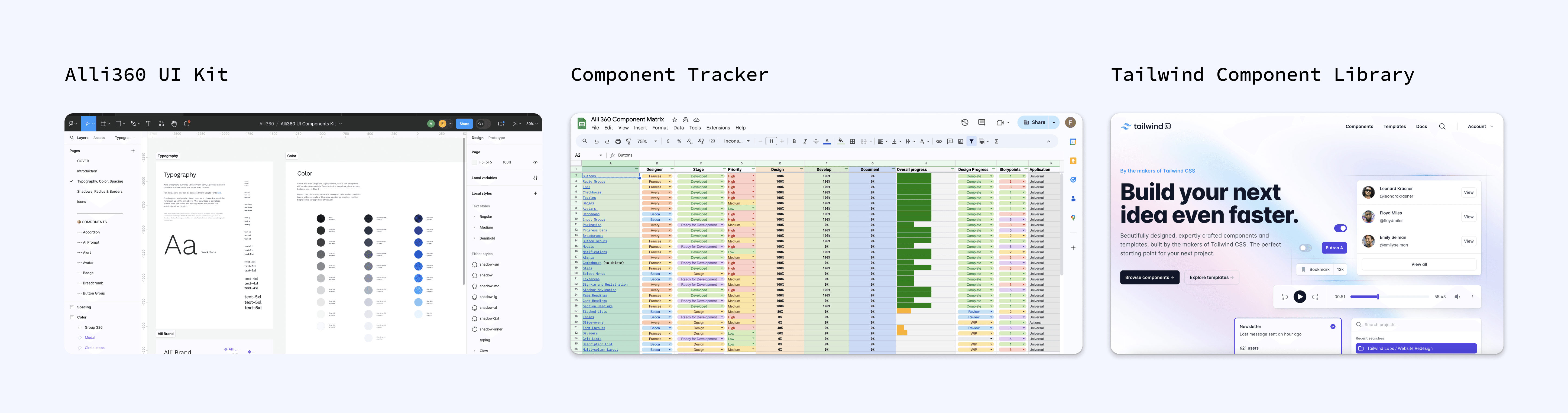
Maintained living design system documentation in Figma
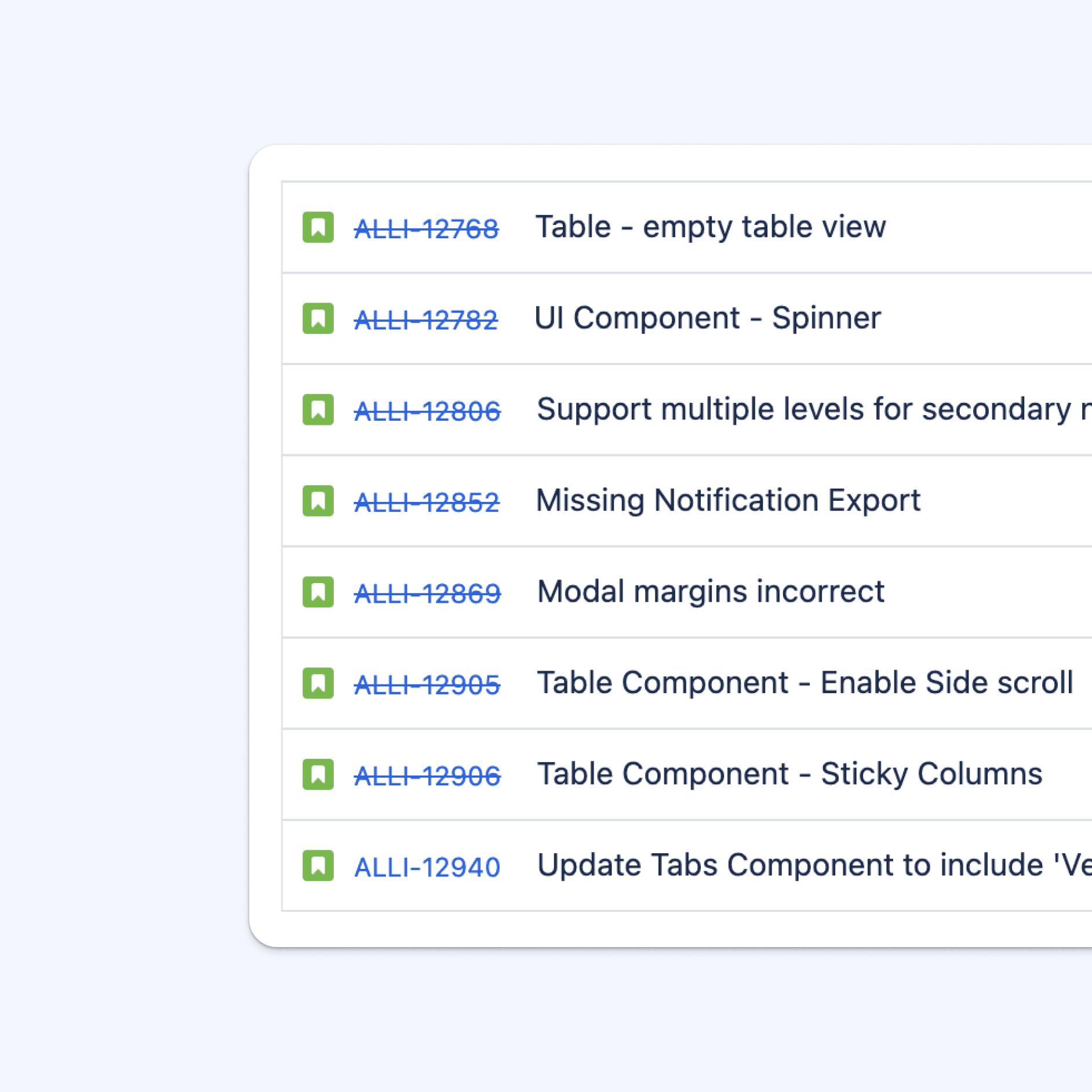
Created a Jira ticketing system to track component progress and dependencies
Partnered closely with my design manager to ensure documentation stayed up to date
Cadence and communication
Led twice-weekly standups to align on progress, blockers, and decisions
Used these sessions to proactively surface risks and resolve design–engineering gaps

02 - Creating a single source of truth
Storybook as the system backbone
Used Storybook to document components, states, and usage
Enabled engineers to define semantics while designers referenced visual standards
Established Storybook as the authoritative reference across teams
Design team alignment
Facilitated whiteboarding sessions to align on new components and high-impact decisions before implementation
03 - Building trust through visibility
Transparency and advocacy
Shared weekly progress updates in Slack
Presented monthly system updates during leadership syncs
Early on, shared external design system case studies to set expectations and gain buy-in
Vision prototypes
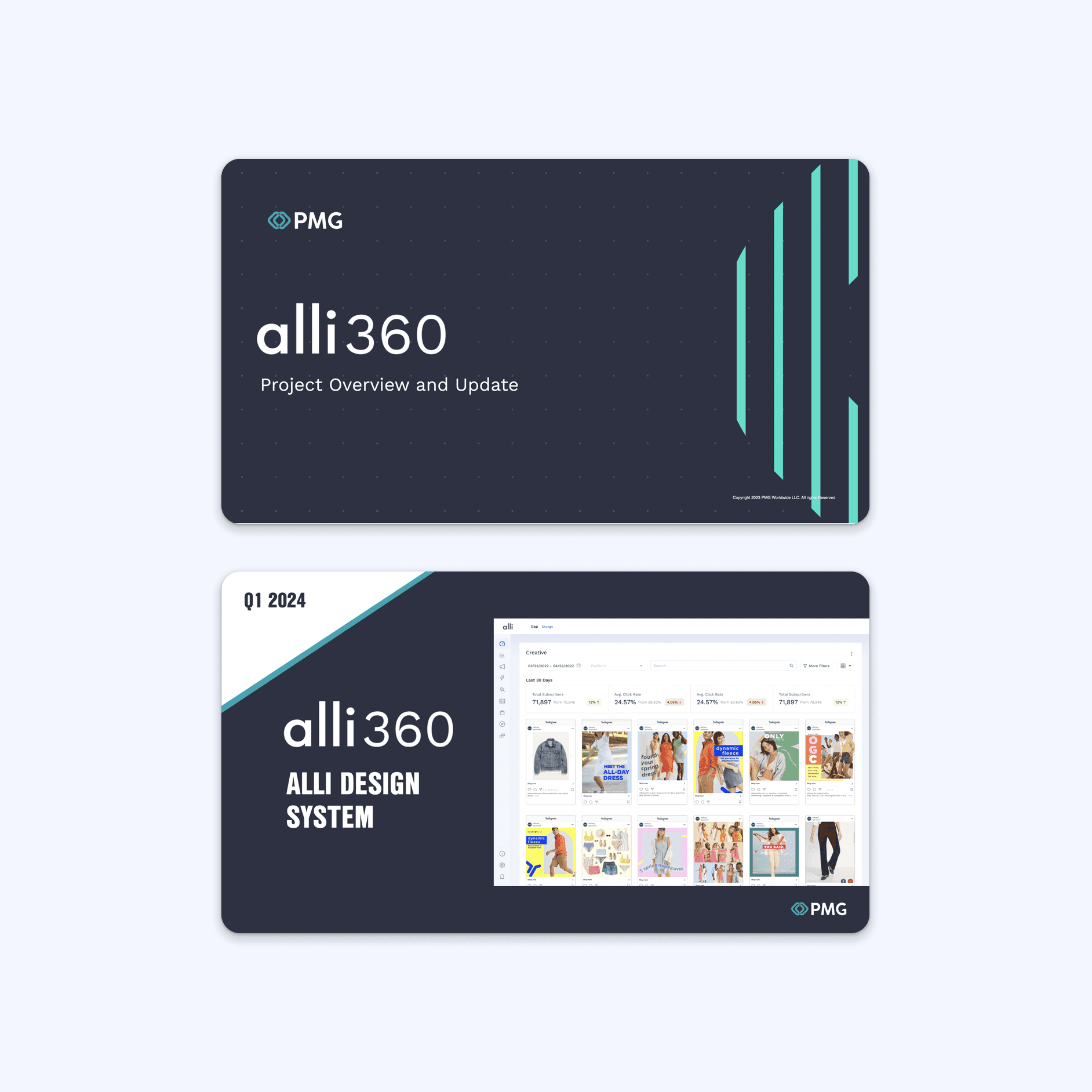
Created high-fidelity vision mocks using the new system to show the future state
Produced two sizzle reels showcased at the March 2024 All Hands, which helped generate excitement and confidence in the direction

Developer handoff during implementation
Midway through the project, the contracted front-end developer transitioned off. I coordinated a two-week handoff with the incoming internal developer, ensuring continuity across:
Component architecture
Documentation standards
Implementation workflows
I also increased sync frequency to help the new developer ramp quickly and avoid regressions.
Strengthening QA and implementation quality
As components began shipping, we noticed gaps between Figma designs and production output.
To address this:
The PM and I established a formal QA review step before components shipped
Designers reviewed components directly with engineers
Set up CodeSpaces, allowing designers to test PRs before staging deployment
This significantly reduced rework and misalignment.
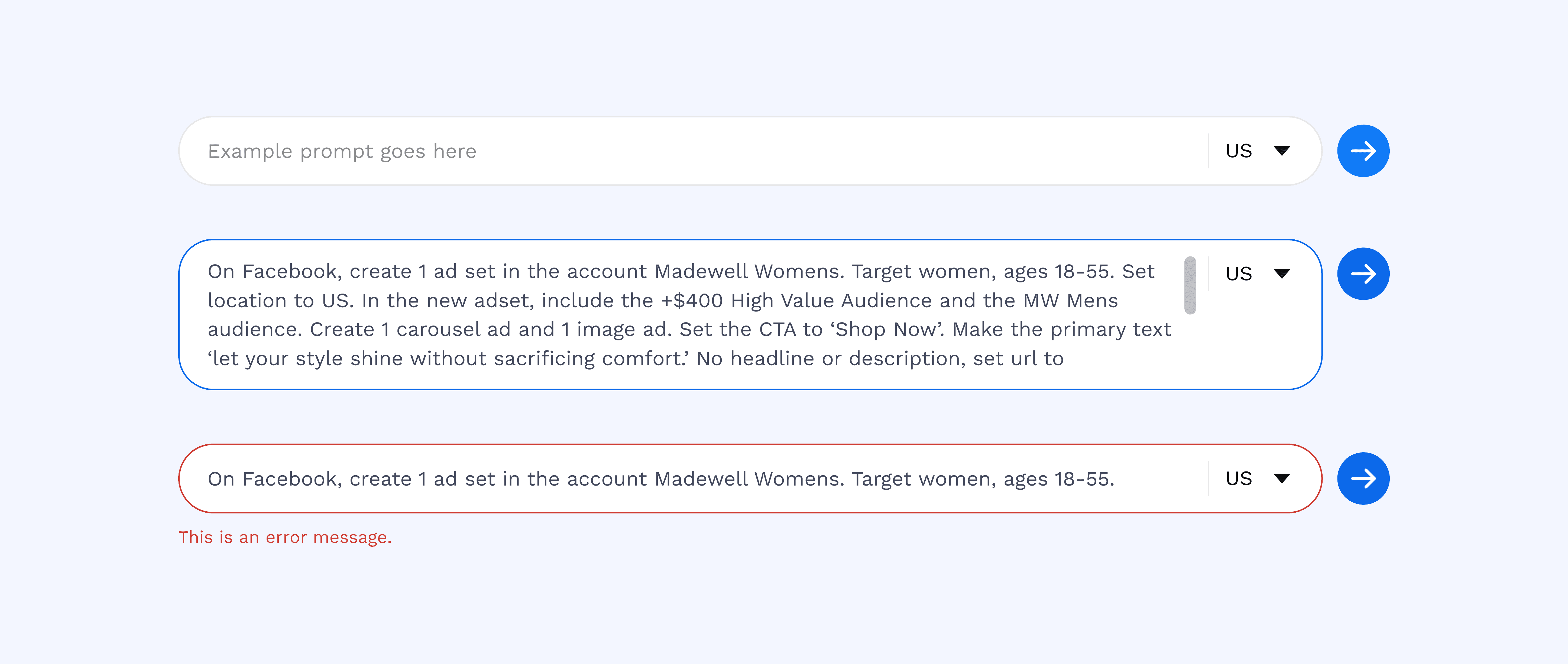
Designing for AI
We ran into trouble where what was produced by the developer did not match the Figma designs. There were sometimes misalignments on the interaction and differences in spacing.
The PM and I worked together to establish a QA workflow where the designer would need to go through new components with the developer before it goes into production. We also set up CodeSpaces which allows designers to test he PR before it is deployed to staging.
A scalable design system foundation
50+ components built and shipped
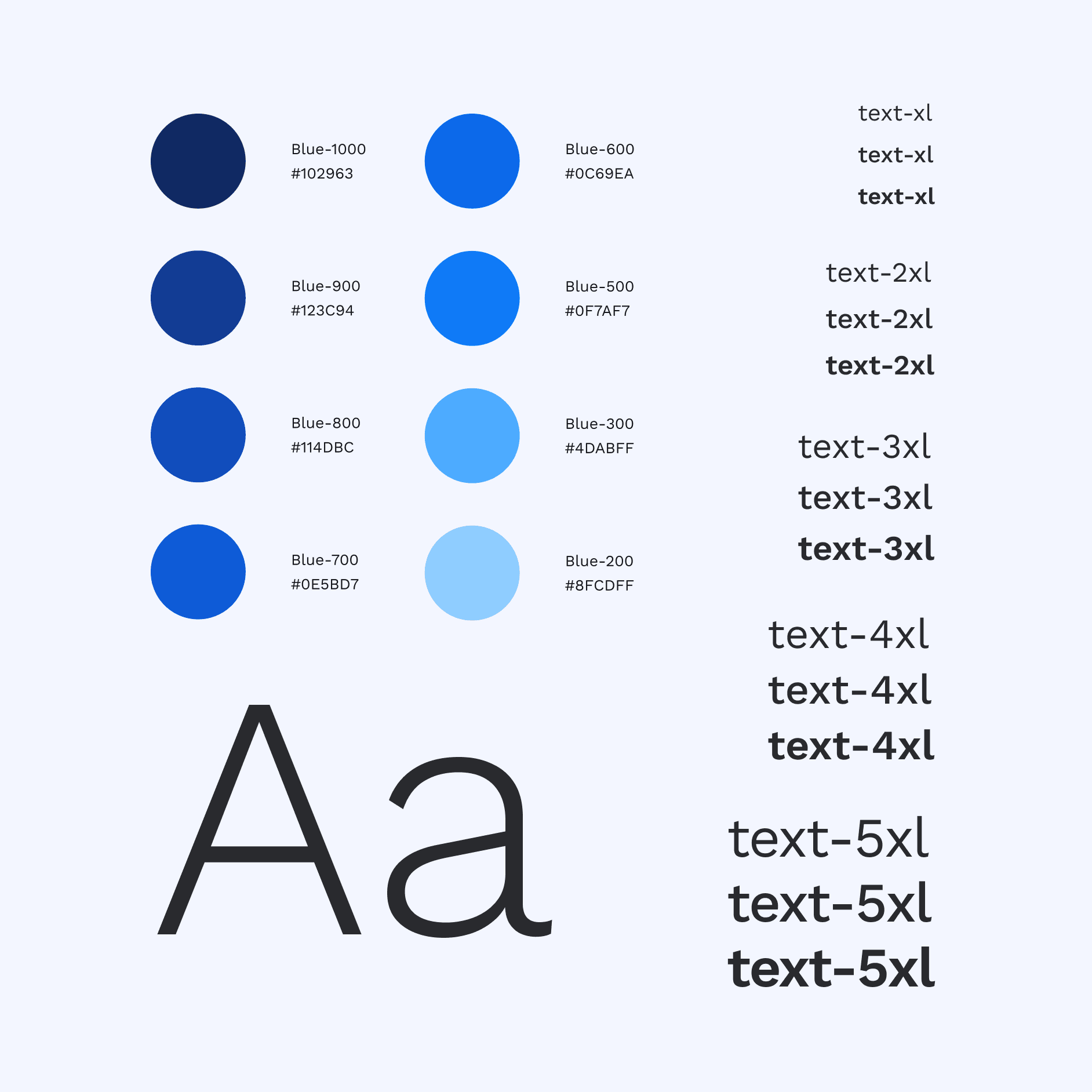
Unified color, spacing, and interaction patterns
Enabled consistent implementation across new and existing pages
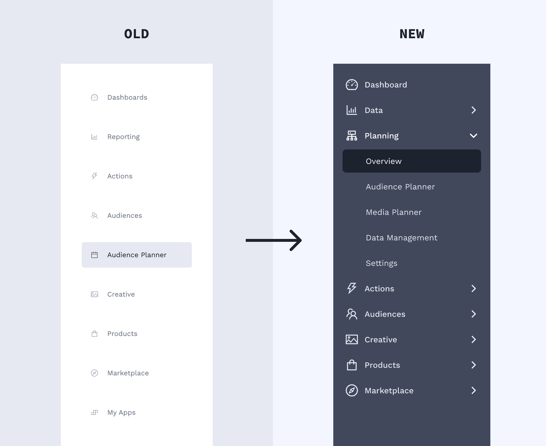
Improved navigation experience
Launched a new collapsible side navigation, optimized for data-dense workflows
Improved hierarchy and increased usable screen real estate
Announced at the March 2024 All Hands with strong internal reception
I partnered with product marketing to craft rollout messaging and produced sizzle reels to support adoption.
Increased efficiency across teams
New product pages shipped with significantly higher consistency
Reduced front-end development time
Decreased QA cycles by eliminating common handoff issues
Established a repeatable workflow for future system expansion
Design impact: The system improved both user experience and internal velocity.

01 — Communication drives systems success
No workflow is bulletproof without consistent, intentional communication. Leading this project taught me how to facilitate productive standups, surface risks early, and create space for cross-functional alignment.
02 — Flexibility is essential for foundational work
Design systems touch everything — people, process, and product. This project reinforced the importance of planning ahead while staying adaptable as timelines, priorities, and team members evolve.